Friday 26 February 2010

Corrections

Here are two old BG's from a 'Goldilocks and the Three Bears' Short we did for Oxford University Press many years ago. You can see they are the same BG but different. That's because one was the first version that had to be redone as it wasn't quite right and didn't fit with the rest of the BG's. Just looking at the two BG's in isolation there doesn't seem much wrong with either of them. But in fitting in with the rest of the show the top one was incorrect as it was too dark and had too many outlines in it.
I think if I had to choose a stand alone favorite now, I would probably pick the top one.

Thursday 25 February 2010

Photo

Here is a picture of a wall in the office. These are the episodes in various stages of production for Driver Dan's Story Train.
First is the episode production letters, then the script number, episode title, story title then the writers initials.
The lines indicate delivery (to the BBC) blocks. For example AW, AX, AY and BA were all delivered together. (AN, AO, AP had been delivered at the time the photo was taken).
This was before some of it was rewritten by Mr John with his incredible neat hand writing. If you look closely you can see an early version of Driver Dan.

Wednesday 24 February 2010

Rubbish Props

I managed to do some more rummaging around the studio and found this old cell. It's the designs for an episodes props. The cell was folded unfortunately. The creased up paper you can see is tissue paper that sits behind every cell to protect the paint.

Tuesday 23 February 2010

Sketches!

Late post today! I was rummaging around the studio and came across this. It's some sketches Mr Phil has been doing to figure out some panels for the storyboards he is doing for Driver Dan's Story Train.

Monday 22 February 2010

A Still

Here is a still from the encounters film festival trailer Directed by Mr Paul. We do them every year but this year they wanted the same characters as last year. So instead of CG environments this one was made in after effects. You can watch it here.

Friday 19 February 2010

Musty swings

This is a still from an episode of Dusty and Musty. He is in flash and the BG's are computer. The BG's were supplied to us from our clients at COG. As you can see he is a very complicated character but we did it and made the series look lovely. It was never aired (I am unaware of the politics behind the decision) and it was a shame as so many people worked hard on it for such a long time. It was a project for HIT.

Thursday 18 February 2010

Props

Late post today, very busy! Here are some more episode props from Franks Cat!

Wednesday 17 February 2010

Old post card


This is one of our old post card mail outs. Back when Mr Bulb was our logo.

Tuesday 16 February 2010

Random

This was a picture put together from the episode called 'Film' for Franks Cat. I think it was for an invite for a party for crew. I can't quite remember. But it's a picture I have saved as I think it's funny.

Monday 15 February 2010

A Turn Around


Here is a turnaround from the character called Dusty. It was from a series we did for the Consortium of Gentlemen and HIT. This is the Flash model we built giving the animators as much assets as possible. In an average scene the animators could possibly use all the body pieces already drawn but if there was a big action scene then they would most likely have to redraw the body to get the motion of movement looking lovely. 9 times out of 10 though the animators would use the head Flash model so the characters would look more 'on model' as possible.
In each head symbol was full lip sync mouth shapes to use which also helped the animators. Basically we always use Flash as a tool and use traditional 'paper' 2d animation skills when possible.

Friday 12 February 2010

Monsters In Real Places blog

Here's a picture I did in lunchtime using an old Photo of mine and a character of ours designed by Mr James for this lovely blog. They put it up yesterday. Give it a go, it's fun.

Thursday 11 February 2010

BG

Here is another Franks Cat BG as they seem popular. This was a one off never used again shot where Heidi in the form of the Werehamster scaled the top of the castle with Lottie in hand. And to complete the King Kong homage Nine was flying around her head in the form of a plane complete with propeller! It was brilliant the way it could be written with some quite bizaro situations.

Wednesday 10 February 2010

Assets


Here is a picture showing all the assets for an episode of BB3B's. We animated 3 episodes and this was from Zombie Pizza Eaters. You can see all the artwork that was supplied to us in Flash for the episode. The main characters have turn arounds but the episode specific designs are just drawings. If you watched the series you may notice that the Grandma is slightly different. Her design changed during production. It was just an aesthetic decision, the final design works much better I think.

Tuesday 9 February 2010

Random

Look what happens when you miss time a scan, opps. But I liked the effect. I think I like the texture of the tissue paper more though as the door to the scanner was open. Tissue paper is used to protect the paint on the back of cells.

Monday 8 February 2010

Size Chart


Here is a size chart to show how the main characters in Franks Cat relate to each other. This was a simple one for the style guide for the series. There is another one which has a lot more characters on that was used during the making of the show. I will put it up later.

Friday 5 February 2010

Character Build

So here is another character from the Finnish ad from an earlier post. On the right is the original client character design. In the middle is the flash model. He has a green tie as we did two versions of the advert but both would feature different colours so we used green so the colours could be 'keyed' in after effects. And on the left is the same Flash model blown apart to show you the different levels. Just to illustrate better what I was trying to explain in the earlier post.

Thursday 4 February 2010

Very Old Logo


Here are two of the very first logo's for us when we were A for Animation. I found these two masters which were used for invoices etc. But as this was in the early 80's it was made using Letraset as computers were not widely used as they are now. So simple things like this were skillfully put together by hand transferring individual letters and graphics.

Wednesday 3 February 2010

Model sheet


This was the original model sheet for the Playbus titles. If you compare this to an earlier post showing the actual animated cell you can see the design was simplified. This was partly down to necessity but also aesthetics as it would be far too involved to animate to this much detail. Also with the budget and the Schedule limitations. The passengers were also silhouette in the final animation. I think that was to allow for character changes as the series went on without having to have new titles. Did I mention it ran for over 10 years?

Tuesday 2 February 2010

Artwork

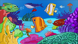
Here are some random fish.

Monday 1 February 2010

Artwork

Here is a comparison between character artwork we are give to animate. On the right is a pencil drawing of a character and on the left is the character drawn up in flash. He is all ready for animating with his legs and feet on one level his body on another and his head is also separate. His tie is it's own symbol also so we could easily adjust it as the clients were unsure if it would need to be coloured in later. This was an advert for Finnish TV. There were about 30 characters so I will show you more of them later.